
Hue & I
f
Studio - Tiny
Role - Communication Designer
+ UX/UI Designer
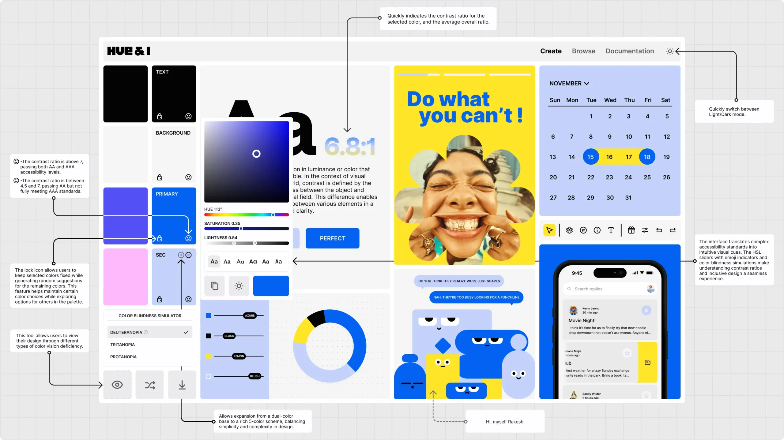
Hue & I is an accessibility tool that empowers designers to create inclusive color palettes. With real-time feedback and intuitive visual cues, it helps streamline meeting contrast ratio standards.
Tool for one, Design for all. Hue & I aims to make inclusive design a natural consideration, not an afterthought. Enabling more accessible digital experiences that cater to diverse user needs.
Your Ally in Accessible Design
Meet Hue & I - your trusty sidekick for creating inclusive color palettes. An innovative tool that empowers designers to select accessible colors by providing real-time feedback on contrast ratios, ensuring your designs resonate with every user.
The name Hue & I isn't just a clever wordplay; it's a reflection of the personal touch designers add to their color choices. It's a subtle nod to the idea that accessibility should be woven into the fabric of your creative process, not treated as an afterthought.
The tool's identity, skillfully crafted in collaboration with the talented Nishtha Sharma, embodies this philosophy, inviting you to embark on a colorful adventure where inclusive design takes center stage from the very beginning.

Intent
Accessibility is often an afterthought in design. Hue & I aims to make accessible design effortless by providing real-time feedback and guidance during the creative process, empowering designers to create inclusive color palettes.
Interface
The interface translates complex accessibility standards into intuitive visual cues. The HSL sliders with emoji indicators and color blindness simulations make understanding contrast ratios and inclusive design a seamless experience.
Interaction
Dynamic interactions are at the core of Hue & I. As designers explore colors, the tool responds with immediate feedback, allowing them to iterate and refine their choices while witnessing the impact on accessibility in real-time.
Role - Communication Designer
Bringing accessible design to life, one colorful creation at a time with Hue & I.
To discuss a project
or for more information,
reach out to:
